
As you can see, the older version (left) used the system's full name as the logo with what came to be known as the "Spiderman font".
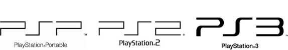
The new logo is similar to the PSP logos but with rounder edges.
The new logo is similar to the PSP logos but with rounder edges.
Sony Computer Entertainment's boss, Kazuro Hirai, explained his reasoning behind the new logo to Times Online.
"I wanted to send the message internally that we are resetting the thinking, going back to our roots. What better way to do it than by resetting the logo? On a practical level, when you have PlayStation 3 spelt out, the aspect ratio was such that if you wanted it on a billboard it became tiny. It didn't work in terms of visibility."
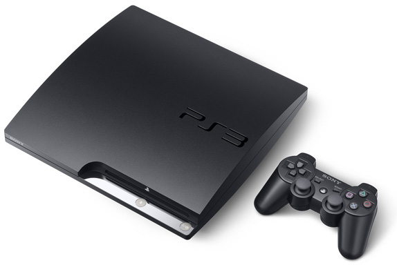 The new logo seems more modern and trendy. I noticed that the repition of curves define the look. I think it looks great, especially engraved onto the system.
Image/information source: Brand New
Posted by 
I never played a lot of video games growing up but I definitely agree that switching from the full name to three characters was a smart move. I mean on the one hand, even if the word was too small to read that font used, "spiderman," was so associated with Playstation that you knew what it advertised. In attempting to update their image though, the new logo is definitely very modern and very smooth in an area that is otherwise dominated by very "techy" fonts.
ReplyDeleteFor uniform branding purposes, I agree that the change to the rounder, curvy three letters versus the entire name is a good move. Huge competitor Xbox's logo is nice and short also. However its logo also has that added dimension of the pictorial aspect along with the lettering. I would like to see Play Station make a step forward similar to this.
ReplyDeleteBut nevertheless, I do believe that if a company is not exactly sure what to do in harsh times of needed improvement, they should either do nothing to hurt their image, or they should reintroduce classics. Sony's boss' idea of resetting the logo back is a smart decision.
The new Playstation 3 logo looks a lot more modern, and once engraved onto the system, it also looks a lot more sleek. I think it represents the system accurately. I like how Sony decided to modify their original logo, as if reminding their consumers that they haven't changed and that they are still dedicated to providing the same service they've been providing since the beginning.
ReplyDeleteHere's what Kayla had to say about this logo on the other class blog: http://graphics2176b.blogspot.com/2009/09/slimmer-isnt-always-better.html
ReplyDelete