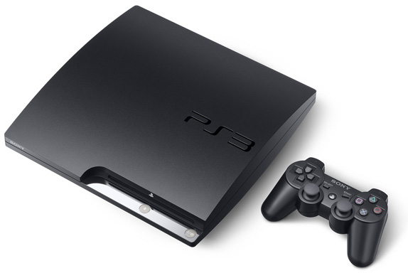
As you can see, the older version (left) used the system's full name as the logo with what came to be known as the "Spiderman font".

The new logo is similar to the PSP logos but with rounder edges.

The new logo is similar to the PSP logos but with rounder edges.
Sony Computer Entertainment's boss, Kazuro Hirai, explained his reasoning behind the new logo to Times Online.
"I wanted to send the message internally that we are resetting the thinking, going back to our roots. What better way to do it than by resetting the logo? On a practical level, when you have PlayStation 3 spelt out, the aspect ratio was such that if you wanted it on a billboard it became tiny. It didn't work in terms of visibility."
 The new logo seems more modern and trendy. I noticed that the repition of curves define the look. I think it looks great, especially engraved onto the system.
Image/information source: Brand New
Posted by 


