Showing posts with label fonts. Show all posts

Wednesday, September 16, 2009

Current Event- New Logo for Playstation 3

Earlier this month, Sony updated their logo design for their Playstation 3 game system. The press release from Sony stated that they would "modify the PS3 brand name from 'PLAYSTATION 3' to 'PlayStation 3', and introduce a new [PS3] logo, which is engraved on the surface of the new PS3 system."


As you can see, the older version (left) used the system's full name as the logo with what came to be known as the "Spiderman font".


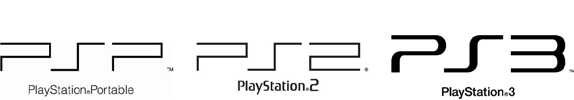
The new logo is similar to the PSP logos but with rounder edges.

Sony Computer Entertainment's boss, Kazuro Hirai, explained his reasoning behind the new logo to Times Online.
"I wanted to send the message internally that we are resetting the thinking, going back to our roots. What better way to do it than by resetting the logo? On a practical level, when you have PlayStation 3 spelt out, the aspect ratio was such that if you wanted it on a billboard it became tiny. It didn't work in terms of visibility."
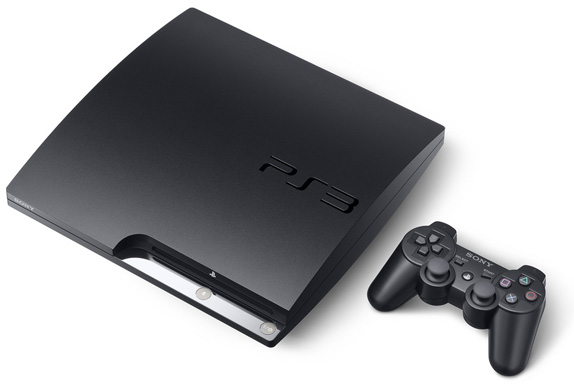
The new logo seems more modern and trendy. I noticed that the repition of curves define the look. I think it looks great, especially engraved onto the system.

I thought Hirai's decision on changing the logo based on the visibility aspect was a smart move.


However, I feel that the old logo looked better running down the sides of the games.

Image/information source: Brand New
Posted by

Friday, September 11, 2009

Reflection on Lupton's Thinking With Type

I never realized that typography had a history or a creative process to it. I always thought of it as just different presets of fonts on a computer. Lupton helps explain why typography is so important in conveying a message. This is relevant to us because we are surrounded by type everywhere we go.

For example, cursive writing denotes sentimental thoughts or sophistication.
Serif fonts gives off a sense of professionalism, sans serif sometimes gives a 'youthful' look (and is also easier to read on the web), bold fonts show power, all Caps is alerting, and so on.

I thought the information on producing new fonts was really interesting. The details between two different fonts can be so minute that an untrained eye probably cannot readily notice the difference. Yet, the differences do have an impact. I like how the book describes fonts as if they have a personality. "Gotham expresses a no-nonsense, utilitarian attitude that persists today alongside the aesthetics of grunge, neo-futurism, pop-culture parodies, and straight historical revivals that are all part of contemporary typography." (30)

Thus, typography can give off the essence of the message you are trying to get across without having to spell everything out. It's interesting how typography can say so much.

My friend who recently graduated from Parsons just posted this video on his blog (nice timing). It's on typography and how it's so important to choose the right font, colors and spacing so that they can appeal to our 5 senses. On the flip side, it also shows how our 5 senses can inspire creativity in producing new typography. This video and the Lupton book show us that type is something that we can experience.

Typophile Film Festival 5 Opening Titles from Brent Barson on Vimeo.

posted by

characters & calligraphy

Fonts that I used on my macbook used to seem like mundane characters that I utilized to get my points across - black scribbles on a white piece of paper - nothing special. But after the reading and class lectures, my font world has opened and I now view calligraphy and typefaces as not merely characters, but accessories to the world that surround me.

The beauty that I find in typefaces and characters is the story that it tells. Never before have I ever analyzed a logo without putting in so much thought and effort. San serifs and serifs have made me more observant, but most importantly, present in the current social media limbo that we are all actively taking part in. Never did I imagine that there could be "good" and "bad" typefaces, and like many minute details in the world, I have often overlooked the construction and history that goes behind these characters and fonts.

I do agree with the other students that the first 20 or so pages in the reading were not as interesting that I imagined or hoped it to be. But what is so fascinating about this subject is the fact that we can finally apply something we're learning right here and right now into the real world that so desperately awaits us. The transformation of fonts and typefaces has transcended just beyond logos and brands, but it has slowly sneaked into our daily lives, bombarding us.

One of my favorite logos is by a shoe company based out of Los Angeles that aims to provide shoes for children in Argentina. Its logo TOMS speaks of the simplicity beyond this concept. The company's One for One campaign gives buyers the reality of giving one pair of shoes to a child in need for every pair that they purchase themselves. The idea is simple and direct, and the logo conveys the idea.