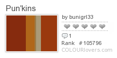
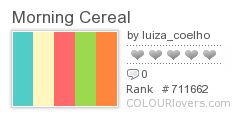
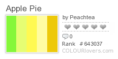
I found this to be a fun and interesting post on ColourLovers by evad. What with the holiday season and all, I enjoyed the variety of color pallets shown depicting colors one should use for designing certain types of food. This is convenient for those designing web sites in need of food depictions, however I think we can also use it in other situations. Color is something whose meanings vary amongst people, but there are overall stereotypical feelings and emotions that can be evoked when using certain colors, or combinations of them. For example, surprisingly the apple pie pallet is extremely bright, when I thought it may include more browns. However, apple pie comes with the assumption of that delicious, granny's apple pie that makes you feel warm and happy all over, hence the bright yellows. Picnic time includes the blue, pink and orange. Maybe these are not the first colors that pop into your head when thinking of a picnic, I thought of green at first. But the blue demonstrates the openness of the outdoors and tranquility. The orange and pink are fun, lively and optimistic. A special sort of connection exists between color, objects and emotions. I believe professional graphic designers have the ability to understand this relationship in order to successfully achieve their goals in overall design and execution.


wow ur right when i scrolled down to the pie one it caught me off guard. however i would like to see a deeper tan or brown and red in there.
ReplyDeletethese are all interesting and i could see myself using the color pallets in other ways
I've seen designers of blogs use this color palette concept as well! I think it is a fun way to group colors together and those colors certainly do depict those items/situations. For example, red and orange hues automatically pop into my mind when I think of pumpkins!
ReplyDelete