


Magazine Identity & Readership
Though my feature article deals with music, I would want my magazine to focus on art and popular culture in general. My personal interests are not limited to just music and I try to have a deep understanding and knowledge of many topics. So, my target reader would be someone who also wants to be well-read in those areas, and in this case, alternative music culture.
Magazine Visual Identity
Because I want the magazine to convey sophistication, yet also possess an aesthetic that is marketable to all readers, the layout should be polished and simple. As a result, a reader who is not as familiar with the topic can enjoy and absorb the information as much as a reader with more background knowledge. By not overwhelming readers, an inclusive readership can be attained.
Article Visual Identity
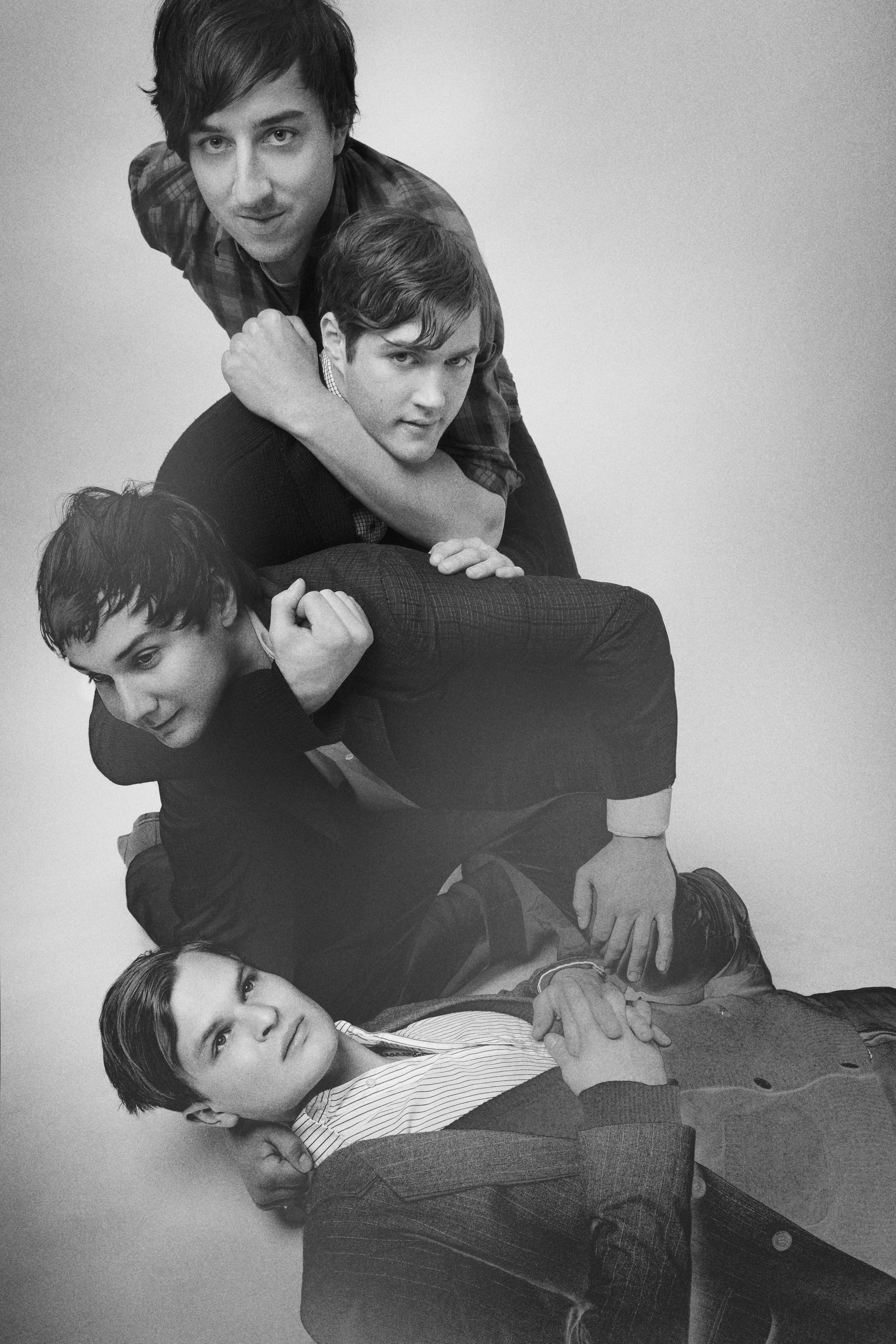
I intended to express several ideas with the article’s layout. I wanted to capture the band’s identity/sound and allude to it throughout the design. Informing readers effectively was also an important task. As was the intent with the magazine’s visual identity, the design and complementary imagery/information had to be equally appreciated by fans of the band as well as those who were being introduced to Grizzly Bear through the article.
Article Design Strategy
With the feature spread, I tried to design a layout that could make an initial and accurate impression of the band. I chose a contrast within the hed and dek (arrangement, size and colors) because it represents the opposing qualities of Grizzly Bear: sprawling but oddly organized. This continues with the jump spread. The tilted placement and fragmentation suggests disorder. But the defined pattern I adhered to, instead, creates order. Also, the sidebar is intentionally very simple because, since most readers would not be familiar with these bands, including the featured artist, an influx of detail would make the reader feel like they were cramming. Chaparral Pro is an easy-to-read, visually pleasing typeface that furthers my method of informing without requiring much of the reader.
Style Sheet
Cover Headline:
ITC Franklin Gothic Std
Individual letters: Medium, “W” 170 pt., “I” 240, “L” 180, “D” 130, “L” 360, “Y” 250
“Cohering”: Medium Condensed, 90, 50 kerning (r/i), -25 tracking
Cover Dek:
Monotype Modern Std Condensed, 24, metrics kerning
Sub-dek: Monotype Modern Std Bold, 36, metrics kerning
Byline and Photo credit:
Monotype Modern Std Wide Italic, 12, metrics kerning; Monotype Modern Std Bold, 16, metrics kerning
Jump spread body copy: Chaparral Pro Regular, 9.5/13, metrics kerning
Drop-cap: ITC Franklin Gothic Std, 400, Medium
Pull-quote 1: Monotype Modern Std Bold, 18, metrics kerning
Sidebar title: ITC Franklin Gothic Std Heavy, 36, metrics kerning
Sidebar sub-head: ITC Franklin Gothic Std Demi, 9.5, metrics kerning
Sidebar section titles: ITC Franklin Gothic Std Book Italic, 9.5, metrics kerning
Sidebar descriptions: ITC Franklin Gothic Std Book, 9, metrics kerning
Caption: ITC Franklin Gothic Std Demi, 7, metrics kerning
Pull-quote 2: Monotype Modern Std Bold, 18, metrics kerning
Drop-cap 2: ITC Franklin Gothic Std Medium, 72
Folio: Chaparral Pro 10, metrics kerning
Page number: Regular
Title: Bold
Date: Italic
Document Grid
I chose to set the body copy in four of the six columns because too much text on a spread pushes readers away. The two-column arrangement on each page makes the article easily approached. Also, to enhance that strategy I made the margins quite wide to prevent the text from imposing upon a reader.
Sources
http://www.annarbor.com/2009/09/03/Grizzly%20Bear%203.jpg
http://230publicity.com/images/Grizzkitchen.jpg
http://www.wers.org/music/albums/reviews/images/veckatimest-cover.jpg
http://blog.yellowbirdproject.com/wp-content/uploads/2009/04/beach-house.jpg
http://www.tellallyourfriendspr.com/herewegomagic/3.jpg
http://wearsthetrousers.files.wordpress.com/2009/02/200209_stvincent1.jpg
Color
I tried to make the layout as colorful as possible because Grizzly Bear’s music often feels like a spectrum. I took colors from their new album to implement throughout the design. But, I did not want the colors to be randomly used. Specifically, the two pages of the jump spread follow organized patterns and similar shades on each side. This, again, allows for Grizzly Bear’s theme of varied unification to come across in the magazine’s design.
I love your cover headline and I think it's really creative how you used the space created to fit in your by lines. You didn't go too crazy with the colors, yet at the same time made it colorful. I also like how you carried over the L to the jump spread body copy. Good job!
ReplyDeleteThe band members look like they're posed in an L, so it was smart to make the L in the headline the largest letter. I love how you used a lot of colors in your design, but it still has an overall clean feel.
ReplyDeletealso, I love this band.
I really love this one. I think your mag design complemented cohesively to the personality and aesthetics of the band. And I also really like the use of the letter L throughout the feature image, typography and drop shadows throughout the magazine. Cool.
ReplyDelete