I've noticed that many of the current event post done for this week revolve around color, as we have been talking about it in class. I wanted to do something a little different though mainly because I thought this was a pretty big deal. Sochi, Russia is the site for the 2014 Winter Olympic Games. Above is the recently released logo for the games, designed in part by Interbrand which is a company that determines the vale of brands, and it has a very noticeable feature. Right in the logo is the ".ru" conveying the fact that this logo is also a website for the games. Thursday, December 3, 2009
The Olympics
I've noticed that many of the current event post done for this week revolve around color, as we have been talking about it in class. I wanted to do something a little different though mainly because I thought this was a pretty big deal. Sochi, Russia is the site for the 2014 Winter Olympic Games. Above is the recently released logo for the games, designed in part by Interbrand which is a company that determines the vale of brands, and it has a very noticeable feature. Right in the logo is the ".ru" conveying the fact that this logo is also a website for the games. Friday, November 6, 2009
Extra Credit: Changes for MSN
Overall, I do not think the new MSN logo was a necessary move because there was nothing wrong with the old logo. However, the decision to change the layout of the website was definitely smart.
Thursday, October 22, 2009
Logo Project


Visual Message
My logo is a green butterfly with the body of a calligraphy pen. Although I am a public relations major, I do not know what specific field I would like to work in. I can promise, however, good quality work and the ability to quickly adapt to environments. Therefore, the butterfly represents the potential I have to transform into a valued and appreciated professional, no matter what field I work in – similar to how a butterfly develops from a cocoon. In addition, I wanted to express that I like to write and consider writing to be one of my strengths. Therefore, instead of using a real butterfly body, I drew the calligraphy pen to represent that skill, which is especially valued in the public relations field.
Audience
This stationery set and business card is designed for employers at a public relations agency.
Design Strategy
I wanted to make sure that people would recognize the calligraphy pen in place of the butterfly’s body. Therefore, I tried to make it seem as though the butterfly’s wings and antennas were hand-drawn. The butterfly is generally regarded as peaceful and calm, and I wanted to depict these characteristics in my logo. I chose Palatino for most of my font choices because it was clean and simple, which I thought was a good portrayal of another set of my own characteristics. I used the font Constantia for the stationery name because, in its bold italics, it looks somewhat handwritten, which helps to tie in the calligraphy pen once again. I wanted to keep a consistent design throughout my stationery set so I tried to apply the striped and boxed patterns in most of my pieces.
Style Sheet
Stationery Name: Constantia Bold Italic; 24/28.8; metrics kerning; tracking: 0
Stationery Contact Information: Palatino Regular; 10/12; metrics kerning; tracking: 0
Business Card Name: Palatino Bold; 10/12; metrics kerning; tracking: 0
Business Card Contact Information: Palatino Bold; 8/9.6; metrics kerning; tracking: 0
Envelope Name: Palatino Bold; 10/12; metrics kerning; tracking: 0
Envelope Contact Information: Palatino Bold; 8/9.6; metrics kerning; tracking: 0
Extras: Color
My logo is colored in two different shades of green. I did this in order to show that I care for the environment and that “going green” is important to me. This “going green” concept is very widely used these days and may now even be considered cliché, but I thought that gave me even more of a reason to emphasize it. If I happen to work at a “green” agency, it will show employers that my standards meet theirs. I also used a tinted shade of purple in the background and design of my stationery set and business card because I thought it complemented the greens well.
Friday, October 16, 2009
Google Schmoogle


Cadillac: A New Logo
Above is the comparison of the two logos. On the left is Cadillac's old logo. it is very simple and evokes a sense of class, which fits perfectly with their luxury cars. On the right is Cadiallac's new logo. Although it is a minor change, I think they got it all wrong. In the new logo, the coat of arms is much more detailed and texture. It makes it feel too busy, which in my opinion takes away from its effectiveness. The wreath in the new logo is a horrible change. To me, the old wreath looks like chrome, an expensive metal. The new wreath on the other hand looks like a cheap, fake, plastic looking metal. This is certainly not fitting for a luxury brand car. Perhaps this cheaper looking metal is just another way for GM (who owns Cadillac) to save some more money. Who knows?You can see Cadillac's new logo on its website, with the company's new slogan, "May the Best Car Win." But sorry Cadillac, but you lost here.
source: http://www.underconsideration.com/brandnew/archives/cadillac_switches_materials.php
Current Event: Hertz Logo Change

Hertz, a rental car business, recently changed their logo. If you go to www.hertz.com you can check out how they implement their new logo throughout their website. According to a post found in Brand New (http://www.underconsideration.com/brandnew/archives/hertz_loses_its_shadow.php), Hertz has slowly introduced their new logo since early this year. Brand New mentions that there isn't much information regarding Hertz's change. I was unable to find much as well so I will simply compare the old with the new.
Personally, I prefer the older logo to the newer logo. I do like how the new version presents a cleaner, sharper look but I think it lacks movement. For a rental car business this is an important consideration. The new logo sort of represents movement with a slight lean to the angle of the letters. However, the old logo represents movement effectively with a drop shadow and bold, block letters.
Another consideration is that if "Hertz" was taken out would the yellow square represent something else? I looked into this and was unable to find any other logo that Hertz is in danger of being compared to. In that sense their design can be considered unique.
Overall, I think the new logo for Hertz represents a simple, clear, and modern image.
Thursday, October 15, 2009
Punctuation Marks in Logos


Friday, September 18, 2009
The connections between brand image and logo design

We all know about Walmart, the big corporation that has been causing a stir and instigating debates for many years about the fact that it is putting small businesses and local grocers out of business. We've seen them pop up everywhere, attracting swarms of people looking to save a few bucks on food, clothes, toiletries, and the like. Their logo is pretty straight-forward: big, block capital letters in a bold sans serif font. It looks exactly like a corporate logo. It's big and in your face, much like the Hummer logo. The logo embodies the company–a corporate entity that has a big, recognizable name. The star separating WAL and MART gives the logo a little character, but the uniform blue color keeps it professional and, well, corporate looking. Recently however, with the increase of business and the advancement of international stores, Walmart has changed their logo by rounding the letters and adding a bit of color. The blue is a little lighter and more fun, and the letters are more rounded, less harsh, and lowercase. Replacing the star is an abstract illustration of something that reminds me of rays of light, implying a new, energy and community interested company. The final result of the logo change is definitely softer and
friendlier to the eye, and projects less of a corporate image and more of a community oriented front. Going back to the note on a more internationally friendly image, research done at several American universities suggests that Eastern cultures, such as those in Asia, are more attracted and open to rounder, softer fonts. For more on this, check out an article at Businessweek.com. That means that this new logo is more internationally recognized and acceptable, something that was surely researched by Walmart's team of designers and artists. Now, most companies have trouble changing their logos, as loyal customers that follow the brand sometimes have strong opinions about the change and how it affects their support of the brand and the brand image. Walmart, as a comprehensive business offering food, clothes, and household items, doesn't truly have a brand following. Nothing from the Walmart brand is especially high quality, and the food that they sell is mostly from other companies, so Walmart customers don't really have brand loyalty–they're just looking for low prices. In this aspect, Walmart is definitely lucky. This logo change seems pretty beneficial to the company, as they've also altered their commercials and overall mission to include community action and focus on local events, issues, and charities. This is also reflected in their slogan, "Save money. Live better". This has made Walmart a much more popular company and star, and overall, this logo change seems to have been the best move possible by a giant corporation looking to change its image.
Thursday, September 17, 2009
Current Event: An uplifting image from a tragic event


Wednesday, September 16, 2009
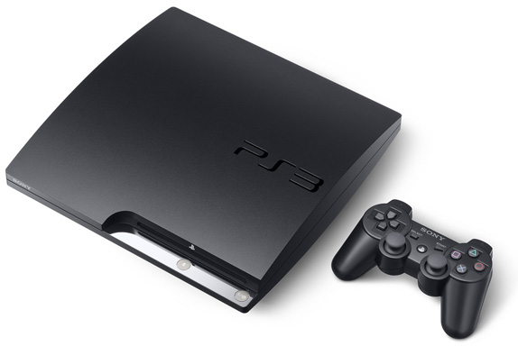
Current Event- New Logo for Playstation 3
The new logo is similar to the PSP logos but with rounder edges.
Sony Computer Entertainment's boss, Kazuro Hirai, explained his reasoning behind the new logo to Times Online.
"I wanted to send the message internally that we are resetting the thinking, going back to our roots. What better way to do it than by resetting the logo? On a practical level, when you have PlayStation 3 spelt out, the aspect ratio was such that if you wanted it on a billboard it became tiny. It didn't work in terms of visibility."
Friday, September 11, 2009
Reaction to Lupton's "Thinking WIth Type"

Lupton's Letters - Typefaces and Their Personalities