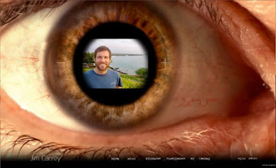
Recently, I saw Entertainment Weekly posted a short blog entry about Jim Carrey's unique and extremely cool new Web site (check it out here). Since it heavily utilizes Flash and we just finished discussing the capabilities of Flash-based designs, I thought it would be useful to post.
This is not a typical Web site. Visuals, not text, become the main interaction with a reader. The links to other pages are far from simple cuts to a static page (click around to see what I mean). Carrey's official site shows the immense possibilities of interface technology.
Also, it might be helpful to visit the company (65 Media) that designed the Web site. Their design is very similar to their work for Jim Carrey.
If only we could design something like this.

honestly, I don't love this website. I think the designers REALLY overdid the animation. I was trying to find just some basic info (his filmography for example) and it took FOREVER to load.
ReplyDeleteAlso, some of the navigation is unclear. You can only find his twitter if you realize that the small bird with a Jim Carrey head is the link to it.
It's a cool concept for a computer game or something, but I can visualize how this would be an incredibly frustrating interface for someone who just wants to find some basic info.