C'est la vie.
Friday, December 11, 2009
hasta luego baby
C'est la vie.
Wrap Up Post
Oh, The Places You'll Go
Wrapping Up GRA217
I remembered the first time I saw Professor Hedges in his office, I told him that I wasn't the best artist in the world... or something along those lines. I also recall Hedges telling us during class that if we think we're not creative enough for this class, he will prove us wrong.
Well, after three long months of GRA217, I am glad to say that Hedges is right. I may not have aced all the projects in this class but I have learned the skills needed to come up with things that I didn't even think I was capable of producing. It's been a tough ride (especially with almost all my weekends spent in lab) but the whole journey was worth it.
So, I just want to take this opportunity to thank Professor Hedges and Chloe, our lovely TA, for their willingness to help and for believing in each and every one of us! THANK YOU! :D
Final Post For Class
Wrap Up Post
Thursday, December 10, 2009
Wrap Up Post
I was initially really worried about this class because I had no previous experience in the graphic design field. I must say that this was a pretty intense course. It was very time-consuming and stressful at times. When deadlines approached, I found myself thinking about concepts and visuals that I could use in my project everywhere I went. It essentially became a big part of my life throughout this semester. Although it was stressful, it was a different kind of stress compared to other classes. I actually really enjoyed learning about the topic itself and the skills (InDesign, Illustrator, and Photoshop). I learned so much within the past 4 months. Since I’m a Public Relations major, graphic design skills and knowledge will be extremely helpful in the future, especially in creating posters, newsletters, or annual reports for a company. I’m really glad that this course was a requirement, or else I would have never taken it. After taking this course, I pay so much more attention to typefaces and graphic designs wherever I go, which scares me from time to time.
Overall, I think the process of working on the projects was much more important than the final products in this course. Despite the fact that I was always stressed during the process of completing the project, I realized that the actual process allowed me to learn a lot. Although I am truly happy that there aren’t any more projects, I am definitely going to miss this class! :(
Wrap Up Post
Wednesday, December 9, 2009
Wrap Up Post
Here's one thing I learned this semester: Even if you're getting an A in one class, that class can still bring your GPA down. How? It sucks a lot of your time and energy out so you can't concentrate on all of your other classes. Yes, I'm talking to you GRA 217!!! This class was very time consuming and that would be the only negative thing about it. It should be 4 credits. (Like seriously. Biology is 4 credits and that has a lab... just like graphics!)
Besides learning technical skills like using inDesign, I learned how to appreciate graphics and see it in a different way. When I look at an ad or text now, I always look at it from a graphic designer's point of view.
So thank you Hedges for teaching me all of that. It totally sucks that you're leaving SU after Spring semester =( ... who am I gonna take Advanced Graphics with now!??
-Christine Oh
Wrap It Up Post
Now, when I look at different ads or logos or whatnot, I find my self saying, "Really?" and analyzing it and thinking of all the things they should have done to make it better. Even though I don't know if I'll ever take another graphics course, or ever do anything that deals with graphics, I'm glad i learned the things I've learned in this class. Especially since I plan to go into the magazine world after college, it's definitely a plus to know how to lay out a magazine design. All in all, I'm actually really happy i took this course.
Tuesday, December 8, 2009
Ryan Gerhardt: Final Wrap Up Post
Friday, December 4, 2009
The New Sun Maid Girl Controversey


The Sun Maid Raisins girl got a makeover and it has caused so much controversy! I don't understand why people are making such a great deal about it, but I personally don't like this new change. Betty Crocker did it, Aunt Jemima did it, and Mrs. Butterworth all did it so I guess the Sun Maid Girl thought she had to keep up and become younger and "prettier" as well. It's probably a result of all the media images that we have around today in television, movies, magazines, etc. Although I have no problem with modern images and such, to me, this Sun Maid Girl looks like Barbie. I thought the old Sun Maid Raisins Girl looked fine the way she was and if anything, gave a more home-ier touch to the brand. Now for some reason, the brand looks like it isn't as authentic and established as it was before. This new Sun Maid Raisins Girl, who by the way looks like she had a fake tan and has a lot of make-up on, makes the brand look cheaper. If I were a loyal customer to the product, I would also start to think if my raisins would change or taste different too. For some reason, the new face of the box bothers me. It just looks so fake and superficial and unpromising? I don't know why, but I don't think I'll buy these raisins anymore. Supposedly the girl is going to get a name and have advertisements that portray her doing "womanly" things such as working out, and going shopping/grocery shopping. She might even speak multiple languages. I understand the company is trying to modernize their brand, but I'm not buying it.
Art Directors Club, really?

The Art Directors Club was formed to bring together layout artists, managers of art departments and art buyers to explore the role of art in advertising. The old logo (the one on the left) was said to have been designed based on an update of Albrecht Durer's signature as he was an appropriate model having had sold his commercial prints on the street directly to people instead of working on commission.
Personally, I feel that both logos do not do a good job of representing the group well. But if I had to choose between the two, the old logo makes more sense than the new one as the old logo has a story behind it. The new logo seems plain and uninteresting especially for a group that is meant to explore the role of art in advertising. The new logo is also misleading as it spells out the name of the club and may just end up confusing people who do not know of this club to think that the group is exclusive to art directors only.
Although the color of the new logo is striking, it is not relevant to the club at all. The typeface used in the new logo has no depth to it. While the old logo doesn't say much about the club, it is at least artsier than the new logo which will most likely attract people in the art field.
In a nutshell, both logos are not doing their job of representing the group's cause and the Art Directors Club NEED to come up with a better logo!
Source: Brand New
New Logo, New Identity

One thing that surprised me about the new logo is that it is completely different from the old one. The font is different; the spacing is different; the emphasis on hierarchy of words is different; the colors are different. In fact, it’s hard to imagine that the two logos are representing the same brand at all, as if the designer wanted the new logo to have absolutely no associate with the old one.
The old logo, with its blue and white colors, looked a lot more reputable. It gave people the idea that OMCA was a museum dedicated to enriching visitors about the history of California. However, when I look at the new logo, I get the sense that it is not a historical museum, but a museum for modern art. The emphasis the old logo placed on “CA” disappeared in the new logo because the letters “O” and “M” are given the same exact treatment. This makes it harder for people – especially visitors who do not live in California – to realize that the museum is about California. I would think this would be one of the more important details of the logo, but it seems as if the designer assumed that everyone already knew what OMCA was and did not take into account the people who may be unfamiliar with it.
Another disappointment with the new logo is that it is hard to read. In an attempt to emphasize OMCA, the designer made those letters bigger and bolder. However, in the process, he split up the word museum into two lines: “mu” and “seum.” Although this may not be the case for everyone, when I first looked at the new logo, I didn’t realize that the two lines were supposed to be combined to spell out “museum.” Instead, “mu” looked like it was supposed to be one separate word, “seu” another word, and the letter “M” looked like it had been placed there randomly. I am not very fond of the way the designer spaced out the name of the museum or emphasized the hierarchy of certain letters. Instead of giving it the modern look that the designer might have been going for, I feel that it makes the logo look like a jumble of random letters that don’t make sense.
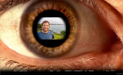
Learning about Flash from...Jim Carrey?

Recently, I saw Entertainment Weekly posted a short blog entry about Jim Carrey's unique and extremely cool new Web site (check it out here). Since it heavily utilizes Flash and we just finished discussing the capabilities of Flash-based designs, I thought it would be useful to post.
Wave to Google: The Google Wave
I will say I was initially and am still very disappointed with the design of Google Wave. For a company that prides itself on ingénue, Google Wave really didn't impress. The navigation and headers were very much like Gmail and although it came with a very thorough tutorial, I still felt let down by the whole application itself. But then again, it is in its early stages. I'm sure the Google masters will find a new way to stump us all.
Thursday, December 3, 2009
The Olympics
 I've noticed that many of the current event post done for this week revolve around color, as we have been talking about it in class. I wanted to do something a little different though mainly because I thought this was a pretty big deal. Sochi, Russia is the site for the 2014 Winter Olympic Games. Above is the recently released logo for the games, designed in part by Interbrand which is a company that determines the vale of brands, and it has a very noticeable feature. Right in the logo is the ".ru" conveying the fact that this logo is also a website for the games.
 Aol

“Aol. One logo, countless ways to reveal.”
I personally do not think that the new AOL logo was a necessary move. I grew up seeing the old logo, so I am used to the iconic running man. The new logo itself is really simple and bold in a white, sans serif font. It changed the O and the L into lowercase letters. However, I think capital letters were more effective and bold because it makes the name stand out more. It seems as though they added the colorful background images to complement the simple logo (Aol.). Although I understand that AOL was going for a new dynamic approach, I do not think it was not executed well. Some of the background images seem really odd and strange (i.e. goldfish). It does not seem like a real logo. I definitely think that they should keep the iconic running man. I am definitely looking forward to seeing people’s reactions when the new logo is fully unveiled.
From Logo Design Love
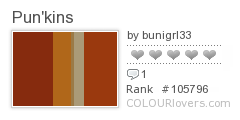
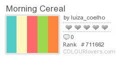
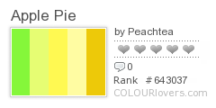
Some Color for Thought...


Current event: The End of Print..?
Though future inventions and other advances are unknown, I don't think print will ever die out. There are a lot of movies out there that show a futuristic society that is so advanced that they don't even use paper. I don't think this will ever happen because people won't let it.
Seeing something in print is a different experience than seeing it on a screen. Though computer graphics and videos open up a door to new ways to be creative, there are just some things that won't elicit the same feelings if you were to experience it in print. This is why I believe there won't be an end to print.
The purpose of the students' projects at Parsons was to "develop and document projects exploring the future of ink on paper through questions of time, memory, language, narrative, sounds, and space."


