Wednesday, September 16, 2009

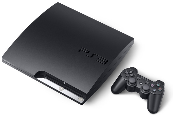
Current Event- New Logo for Playstation 3

Earlier this month, Sony updated their logo design for their Playstation 3 game system. The press release from Sony stated that they would "modify the PS3 brand name from 'PLAYSTATION 3' to 'PlayStation 3', and introduce a new [PS3] logo, which is engraved on the surface of the new PS3 system."


As you can see, the older version (left) used the system's full name as the logo with what came to be known as the "Spiderman font".


The new logo is similar to the PSP logos but with rounder edges.

Sony Computer Entertainment's boss, Kazuro Hirai, explained his reasoning behind the new logo to Times Online.
"I wanted to send the message internally that we are resetting the thinking, going back to our roots. What better way to do it than by resetting the logo? On a practical level, when you have PlayStation 3 spelt out, the aspect ratio was such that if you wanted it on a billboard it became tiny. It didn't work in terms of visibility."
The new logo seems more modern and trendy. I noticed that the repition of curves define the look. I think it looks great, especially engraved onto the system.

I thought Hirai's decision on changing the logo based on the visibility aspect was a smart move.


However, I feel that the old logo looked better running down the sides of the games.

Image/information source: Brand New
Posted by

Friday, September 11, 2009

Reflection on Lupton's Thinking With Type

I never realized that typography had a history or a creative process to it. I always thought of it as just different presets of fonts on a computer. Lupton helps explain why typography is so important in conveying a message. This is relevant to us because we are surrounded by type everywhere we go.

For example, cursive writing denotes sentimental thoughts or sophistication.
Serif fonts gives off a sense of professionalism, sans serif sometimes gives a 'youthful' look (and is also easier to read on the web), bold fonts show power, all Caps is alerting, and so on.

I thought the information on producing new fonts was really interesting. The details between two different fonts can be so minute that an untrained eye probably cannot readily notice the difference. Yet, the differences do have an impact. I like how the book describes fonts as if they have a personality. "Gotham expresses a no-nonsense, utilitarian attitude that persists today alongside the aesthetics of grunge, neo-futurism, pop-culture parodies, and straight historical revivals that are all part of contemporary typography." (30)

Thus, typography can give off the essence of the message you are trying to get across without having to spell everything out. It's interesting how typography can say so much.

My friend who recently graduated from Parsons just posted this video on his blog (nice timing). It's on typography and how it's so important to choose the right font, colors and spacing so that they can appeal to our 5 senses. On the flip side, it also shows how our 5 senses can inspire creativity in producing new typography. This video and the Lupton book show us that type is something that we can experience.

Typophile Film Festival 5 Opening Titles from Brent Barson on Vimeo.

posted by

Typography in Real Life


Got funk?

Since reading the Letter portion of Lupton's book, I am noticing all different aspects of typography surrounding me. I think it is extremely interesting how typefaces families emerged. I had no idea that separate fonts were used for screen versus print, what an x-height is, ascender, etc. I believe type tells a story within itself as it can be executed in such a variety of ways, not only through the actual font, but also through the use of tracking, leading, word spacing, kearning, etc. It can get pretty funky (the things you can accomplish with typography!)

I have choosen this poster as an example of excellent typography. The font choosen is very appropriate for the James Brown concert along with his style of music. It's loose and, as mentioned above, funk. What I find truly amazing and noteworthly is how the artist must have used the perfect amounts of kearning, leading, word spacing, etc. to create the dips, rounds, juts and other movements in the shape of his face. We can perceive depth demension and shape to the utmost degree (we can even see his tongue.) Surrounding the head another font variation is used in all caps with a seemingly condensed look. I believe this was a strong choice in that the caps show the importance of following the letters as they move in towards the main focus, being his head. The condensed aspect makes the eyes follow the movement as the texts also decreases in point size. All together, the lines form an almost sunlight glow behind the head going even further to make it the center of attention. It simply just pulls you right in.

And lastly, the information positioned at the bottom left, along with the use of yellow color for "James Brown" and a larger point, but same font as the face,
maintains the connection of the face with the name and follows the movement which the condensed cap type portrayes. It's also close to the face, making it easy for the reader to skip down to. The entire piece gives off an optimistic and joyful tone which in turn, from an advertising perspective, will attract many people to this show.

A picture...oh, uh, strike that, a LETTER is worth a thousand words!

Whoever first said that writing is a form of expression should have added a little note to give credit to typography too.  Sure, when reading a sentence, paragraph, advertisement, or story, you can use your voice to inflect emotion and character, but when you are only given a visual, designers rely on typography to get the point across.  The size, shape, and font of the text matter.  The color, the flourishes, and the placement of the text have a difinitive impact on the way that text is interpreted.  In advertisements and logos, text is crucial to the product and the company.  In class, we looked at the Hummer® logo, and tested out different fonts o
n the word, but none seemed to fit besides the bold, Sans Serif text that we all recognized as the real thing.  The letters are bold, bulky, and in all capitals, creating an overpowering sense, such as many feel on the road with one of the big, tank inspired cars.
If we looked at a poster for any one of the 
infamous "Saw"
films, even without any visuals besides the text, we would instantly recognize it as a horror film because of the spooky text.  Text is one way that we use to draw associations with brands, movies, places, or emotions.  Other examples include Verizon, which features an added descender to the "z", and Walt Disney,which, without the distinctive lettering, would not be as recognizable.  Both brands are instantly recognizable by the text, which proves that a picture, or in this case, a font, is worth a thousand words.   Lupton stresses that everything–stems, bowls, ascenders, descenders, and everything else that makes letters in different
fonts look like they do–are important.  Whether the reason be because the letters were created for digital display, like Matthew Carter's Verdana type, or Times Roman, originally created for use in a London newspaper, each font and the individual letters involved are important to the way the message is both read and conveyed.  


Reaction to Lupton's "Thinking WIth Type"


I never really thought too much about typeface until reading Ellen Lupton's "Thinking With Type." The world of type, for me anyway, is pretty much limited to Times New Roman. However, after reading Lupton it has become clear that typeface does much more than just create words or a logotype on a piece of paper. We are bombarded on a daily basis by typeface. Often times, unbeknownst to us, we form connections and emotional value to them.
For instance the Coca-Cola logo is known all over the world. It has changed over time sometimes even depending on the holiday. The one thing that has remained since 1886 is the logotype. The typeface that Coca-Cola uses is known as Spencerian script. It was developed in the mid 19th century based on a form of formal writing that was popular in the United States at the time (see www.logoblog.org for more information). I think I can safely say that if any of us saw any other word put in the Spencerian script, we would automatically think of Coca-Cola.
I suppose that it is quite easy to take typography for granted. After reading Lupton I think it will be really hard to ignore the impact it really has. The first part of the book Letter, offers the historical background of typefaces. I found it interesting they originated from calligraphy and how it serves as a functional basis for design.

Lupton and the importance of typeface

After reading Lupton and after talking about typeface in class, it's hard to believe that I never really took notice of different fonts, word arrangements, etc. All my life I've been exposed to typeface in numerous ways (ads, different websites, books, etc.) But only now have my eyes been open to the importance of typeface.
The font, the spacing, the arrangement-it's all important to how the message is conveyed. Never before have a realized this so clearly. In the past I have been ignorant to the fact that typeface is so important. I never looked at an advertisement or a company's logo and thought, "That's nice, but the typeface looks off." Now, I'll look at a logo or poster and think if the typeface conveys the right message.
What really opened my eyes to this was the example of Hummer. If the Hummer logo was any different, a thinner font or more spaced out, it wouldn't fit the product Hummer sells (which are over sized, gas-guzzling SUVs).
As we have said, typeface is used in different ways to convey the type of a certain product. this is ertainly evident in movie titles. The way in which a title of a movie is written often hels to predict what type of movie it will be. Look at the poster below for "30 Days of Night." This movie was classified as a horror movie. On the poster, you can see that the title is written in blood read and in a font that looks as though it were speared on, which gives it an eerie tone.


In contrast to this, look at the poster above for "Dude, Where's My Car?". In this poster, the lettering is big and bubbly, which gives it a fun effect. This is much more fitting for a comedy, which "Dude, Where's My Car?" is.

Typography in Live Music


I decided to look for interesting examples of typography in what I research most - music. The inspiration definitely sprung from our class discussion about the Lou Reed and Loretta Lynn posters. While our music tastes ultimately depend on the music itself, no matter what genre of music your preference falls in, you will almost never find a boring concert promotional poster. They want and need our attention. If we don't take notice and "hear" the band's message, no one will be hearin' their tunes.

Though these posters rely on creativity and coming up with fresh ideas, each example I found also relies on one or more basic functions of typography that Lupton discusses. The three posters I chose to share with you all are visually intriguing but also representations of what typography can achieve when adhering to Lupton's foundations.

So, first up, I have a poster for the Lollapalooza music festival held in Chicago each summer.

Click here for a larger image.

This poster exhibits the importance of hierarchies in typography. The festival has a lot of bands coming so the poster's creator decided to use descending sizes of text for emphasis. It denotes who are the headliners that may draw bigger crowds and leaving it up to those interested in the less well-know acts to scan the entire page. Also, the condensed grouping of text ensures that someone viewing this poster will have to take time to stop and read everything to find what they want. That creative decision, as well as the legibility of the text even as size decreases, allows for information to be absorbed easily. And, don't forget the P.T. Barnum-style "circus" promotion on the bottom left and right corners.

On to example two: a poster promoting a Portishead performance (image at top left).

The text on this poster demonstrates the diverse ways text can be incorporated. In this case, the white letters on the woman's black silhouette appear to be a dress design, but it is only the text manipulated to arouse imagery in the viewer's head. Lupton's idea of a text and image working together is exhibited here. The white letters are, simply, just white letters. But, when applied to the poster, the white text helps to create an almost noir atmosphere (which Portishead's music often is compared to), with the woman being a femme fatale. The result all has to do with uniting text and image, a simple idea that can be used for more complex graphic goals to make text become more than just letters on a page.

And, finally, the image pictured top right is a poster for a live show featuring The Walkmen.

This is another example of text becoming something more. The concert information becomes part of a re-creation of a tape deck player (anyone still use one?). It creates a sense that The Walkmen's music takes inspiration from classic styles of music, which the band actually does. Once again, text and image merge. But, also, Lupton (and our class) discusses the importance of spacing and its effect on the message presented. Because the concert information is spread out around this picture, the viewer becomes more engaged with the image. With this piece, you are receiving information but in a different way that is still accessible.

Well, hope those were interesting for everyone. If you can think of any cool music posters, post 'em. I won't hesitate to check them out.